2.21.2010

That Sunday Feeling....

{Image by designer Muro Buro}

Ahh such a nice Sunday nearly over and another busy week ahead! After scrolling through so many design blogs I've felt a little bit inspired to clean mine up and look a little more professional. There are so many things you can do which I have not yet discovered so it's time to have little play around with the layout me thinks, so here goes.... Like the above piece of fab hand written typography...I just want it to look nice!!! Definitely my new motto.


2.16.2010

100 ways...to say HELLO


This project was one I kind of (and regretfully) rushed. The idea was to create 100 postcards which explore 100 different ways to say hello, this included different accents, sign language, braille etc. I hoped to then turn this collection of postcards into a series which would celebrate other methods of communication such as 100 ways to say I Love You and 100 ways to say Goodbye. Each of the postcards were hand-cut and were also an exploration into hand drawn typography. I wanted the hand drawn type on each individual card to reflect the phonetics of the word, however due to my lack of time I did not focus on this enough.

YCN Fedrigoni: PAPER PROMOTION


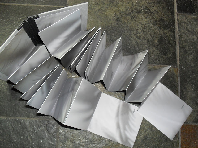
My response to this brief was a series of hand-cut bookmarks which could be sent to existing and new clients promoting the paper company Fedrigoni and invite them to visit their London showroom. I once heard 'everyone loves to get something nice in the post...' this is so true so I thought I would do just that and create something unique and personal to mail out. I thought of creating the bookmarks as I initially began thinking about what kind of envelope would stand out on a desk amongst all the regular manilla ones. An elongated envelope was my solution which would have a certain tactility to it created by a single 'f' cut-out to represent the name of the company. Cutting out the letter would enable the receiver to have a glance into the contents, provoking intrigue regarding the contents and the sender. As the bookmark is acting as an almost buisness card/ invitation, I was fully aware of the corporate side of my designs which is something I wanted to avoid. I really wanted the bookmarks to look hand-made and unique, something which could be kept, used and referred to time after time. The list of words on the front of the design were hand-cut and hilight the endless possibilities within a single sheet of paper. Using words like 'ink,' 'sew,' 'cut' and 'fold' illustrate another side to design, with hand manipulation and hand crafted pieces becoming more dominant in contemporary design- I would hope the mail would appeal to artist and crafts people who chose to create work by hand rather than solely use digital media in order to simply print on Fedrigoni paper. The companies logo, address and website was simply printed on the reverse of the bookmark as to not detract from the quality and beauty of the paper used. I chose to stick with white, black and 'kraft' paper to keep tones natural and I think they work really and look very effective, especially when placed inside and hand-written envelope of the same colour. I would like to expand this project futher and probably could have created an event surrounding my designs to be held at the showroom, if only I had better time management!!
2.15.2010

Silence "The Falling Man"


Final Responce to the project 3:1, 'Silence.' The handmade trouser book convey's the story of 'The Falling Man,' which was inspired by the iconic image of the man jumping from one of the twin towers on 9/11. The shadow's of the feathers represent the unidentified individual falling gracefully and each page uses a single word to convey his thoughts and feelings as he jumped. Feather's fall unidentified from above us as did many brave individuals during the terrible attacks which took place and I would hope that each of the cutout feathers and shadows would sympathetically reflect this and each person's unique bravery. The narrative within the piece is almost poetic and the words can be compiled in many different ways depending on the reader. The trouser book format was used as each 'leg' when opened fully is symbolic of each of the towers as is the falling motion of the pages when the book is opened. A simple greyscale colour palette was maintained to keep in with the sombre tone of the book.

2.08.2010

Hello again...

WOW such a busy month after Christmas with assesment and dissertation deadlines I've felt like I have had not one single moment to bore everyone with a blog! So here its goes, not really given many updates on my recent work, so thought this was the perfect opportunity to round up last term and show you my finished pieces...
Related Posts with Thumbnails